Identifying Patterns in Bikeshare Trip Making
mattwigway
Bay Area Bike Share has recently released their trip history data; the data file contains the origin station, end station, time and date, and user type (day-pass or subscriber) for all the trips taken on the system since its inauguration on August 29, 2013. For another project, I had calculated accessibility measures for each bikeshare station in the Bay Area Bike Share system (using the beta OpenTripPlanner transportation analysis suite; see this post and the attached paper). I wondered if there were different types of trips represented by different accessibility footprints (e.g., trips that have high job accessibility at one end but not the other may be commute trips).
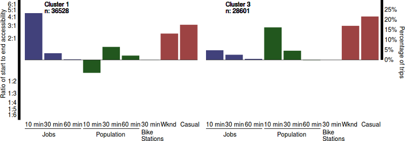
To examine this, for each trip I took a ratio of start and end accessibilities in several categories: jobs and residents within 10 minutes of the stations by walking, jobs and residents within 30 and 60 minutes of the stations by walking and transit, and other bikeshare stations within 30 minutes by cycling. So, a ratio of 4 for jobs within 10 minutes indicates that there are 4 times as many jobs within 10 minutes of the start station than of the end station. I took natural logs so that scores when the end stations are more accessible have the same magnitude (e.g., a score of 4 and a score of 1/4 have the same magnitude when log-transformed).
I then applied k-means clustering (James et al. 2013, 386) to the generated accessibility scores for each trip to see if there were distinct trip fingerprints. I tried several different values for the number of clusters k, and settled on 4. This corresponds to only two distinct categories of trips, because return trips of round trips have the inverse footprint. The results of the clustering can be seen in the visualization. Along with the accessibility ratios, the percentage of casual users and the percentage of trips in each cluster made on the weekend are shown as well (these variables were not used for the clustering). Note that, while the scale is presented in terms of the original ratio values, the values are still log-scaled. I used R for the clustering, and D3 for the visualization.
Clusters 1 and 2 appear to represent commute trips, as they have high (in magnitude) scores for jobs within 10 minutes, indicating that one station is in area with far more jobs than the other station. Clusters 3 and 4 represent other types of trips, with higher scores on resident population. These may be trips from transit stations to residential areas, or trips from residential areas to shopping areas. One interesting thing is that these trips are taken more on the weekends and by casual users (those with one- or three-day passes). Previous research has shown that, in Washington, DC, there is a statistically significant difference between all pairs of morning, midday, afternoon and evening weekday and weekend bikeshare trips.
All of the clusters are dominated by one of the 10-minute categories. This makes sense; these variables have the highest variance, and thus drive the clustering. I chose to not standardize the variables, because they are unitless, and there actually is more variance in the ten-minute ratios. The reason is not hard to discern: the ten-minute ratios are based on the number of jobs in a smaller area, and thus can vary more quickly in space. One can think of the numbers as a kernel function; the accessibility measures with higher cutoffs are effectively wider kernels.
This project is descriptive and has produced some interesting observations. Tripmaking patterns differ between subscribers and casual users, and also differ between the weekdays and the weekends. Work-driven trips are made more by subscribers and on weekdays (unsurprisingly). There are probably additional dimensions that would provide more detail, especially in clusters 3 and 4. In particular, I’d like to calculate accessibility to retail and transit stations (it has been shown in Washington, DC, that people often use bikeshare to access retail, restaurants, and transit stations).
This visualization was created for the Bay Area Bike Share 2014 data challenge. The visualization itself is available on my projects site, and the source code is on GitHub.
