Identifying high quality transit corridors
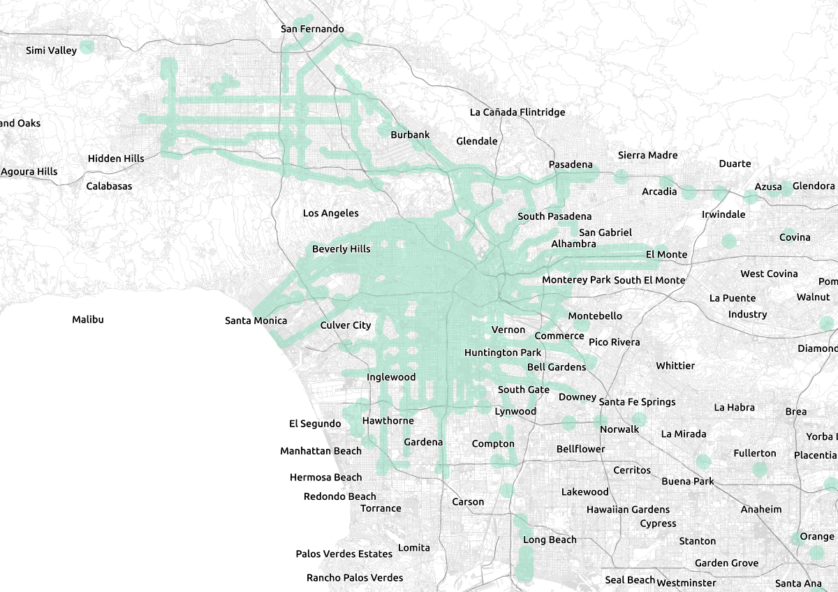
In my previous post, I analyzed the effects of a proposed bill in California that would dramatically upzone areas around transit stations, allowing for increased housing production, albeit potentially creating opposition to transit projects. In that post, I presented a map showing the area potentially affected by the bill, and I promised a further explanation of the methodology used to create it, which I present here.

Areas in Los Angeles potentially affected by SB 827. Data © LA Metro, Metrolink, OpenStreetMap contributors.
The code used in the analysis is open-source and available here. It is written in Python 3, using a Jupyter notebook.
The bill establishes certain requirements for zoning codes in areas within 1/4 mile of a “high quality transit corridor” and within 1/2 mile of “major transit stop,” in order to prevent low-density zoning in areas well served by transit. High quality transit corridors are defined as fixed-route bus service coming at least every 15 minutes at peak. Major transit stops are all rail stops, ferry terminals that connect with another mode of transit, and places where high quality corridors cross. I needed to identify each of these pieces, and then buffer them to create the final map.
Finding rail stops was easy. I downloaded the GTFS feeds for LA Metro rail service and the Metrolink commuter rail. I then loaded them into Python using gtfstk and extracted all stops that had service. There is no ferry service in Los Angeles, to my knowledge, so I did not include that here.

Many lines overlapping to provide high frequency service in Brisbane, Australia (author pictured for scale).
I then needed to identify the high quality transit corridors. This proved to be much more difficult. The first question is the definition of a “corridor” — if several routes overlap on a common segment and provide service at least every 15 minutes, is that considered a corridor? I felt that it should be, as many transit agencies explicitly plan this by operating “branching” service, where suburban bus lines come together to form a high frequency spine through the densest part of the city (Brisbane, Australia, for example).
Detecting this from GTFS data, however, is not necessarily trivial. These vehicles may not share the same stops along the corridor (and with real-time arrival information, it is relatively easy for a user to determine which vehicle will arrive next, and go to the appropriate stop, assuming they are nearby). This is particularly true of express or skip-stop service (for instance, most Metro Rapid routes in Los Angeles); one route stops at all stops, whereas another stops only at a few of those stops.
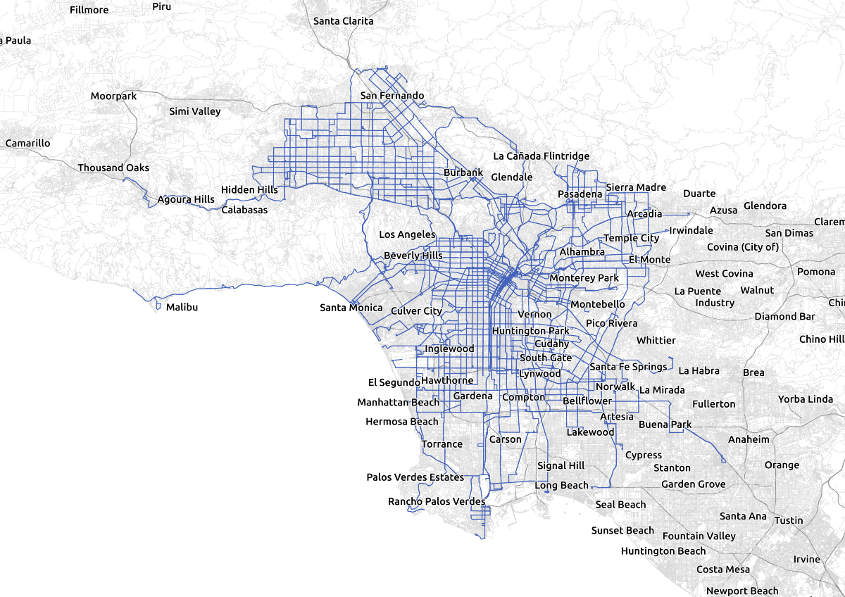
In order to find corridors, I snapped all of the LA Metro’s bus routes from their GTFS feed onto the street network using the map-matching capabilities of Valhalla. First, I identified patterns in the GTFS feed, which are unique sequences of stops visited by a vehicle. This is an optimization step; rather than individually snapping every trip to the street network, I snapped each pattern to the street network, assuming that all trips that visit the same stops will use the same streets.
I loaded an OSM extract of the LA basin from Mapzen Metro Extracts into Valhalla, and then used the trace_attributes API to snap each pattern onto the OSM network. Where possible, I used the GTFS shape data; if this was not available I generated a geometry using the stop locations. Sadly, Mapzen is closing down at the end of this month, so OSM extracts for metropolitan areas may become harder to come by; the extract I used is reproduced here. I used the build_valhalla.sh script in the linked GitHub repository to read the data and start Valhalla.
The information returned from Valhalla is a list of edges traversed by the route. These edges are derived from the OpenStreetMap network and roughly correspond to one block, the stretch of road between intersections. Valhalla edges are unidirectional, so one direction of a route does not share edges with the other direction (if it did, a route that passes northbound every 30 minutes, and southbound every 30 minutes, could qualify as a high quality corridor if the timing was right, a situation that is clearly incorrect).

The Los Angeles Metro bus network, snapped to the street network. Data © LA Metro, OpenStreetMap contributors.
For each edge, I found the nearest stop on each pattern to the start of the edge. I collated the departures at those stops for all patterns traversing the edge, and estimated the headway. One factor that could be improved is that I did not interpolate the position of edges between stops; I considered that a bus traversed that edge at the moment it left the nearest stop, when in reality it could be some minutes later, depending on the distance to the stop. This is not an issue, however, since I am only estimating the headway, unless two routes that share a street segment do not have the same or similar previous stops. If buses leave from the same stop five minutes before they reach this edge, the headway between them will still be correct, even if the absolute times they traverse the edge are not. If the routes that traverse an edge don’t share the same or similar previous stops, however, this could introduce bias. This does occur in Los Angeles along Metro Rapid routes, which frequently overlap a Metro Local route, and should be corrected in future versions of the software.
I then computed all the inter-vehicle times on the segment between 7 and 9 AM, and between 4 and 6 PM. So if vehicles came at 7:05, 7:15, 7:26, etc., I would compute inter-vehicle times of 10 minutes, 11 minutes, etc. The bill states that vehicles must come no less than every 15 minutes, but in order to smooth over some of the variation introduced by not interpolating times, and to avoid disqualifying a segment if vehicles generally come at least every 15 minutes, but there is one 16 minute gap, I took the 85th percentile headway. I considered segments with an 85th percentile headway of less than 15 minutes as part of the high frequency network.
To determine the major transit stops where two high-frequency corridors cross, I intersected every edge that was part of the high frequency network with all of the others. If there was an intersection, and if the edges did not have any routes in common, I considered this a major transit stop. I required the edges to not have any routes in common to avoid declaring places where a route made a loop or intersected itself in the opposite direction to be major transit stops.
I created a 1/4 mile buffer around the high quality transit corridors. I then removed any disconnected portion with an area of less than π0.25² + 0.5 square miles, which happens to be the area of a 1/4 mile buffer around a straight line 1 mile long. These areas are likely to be data errors (for instance, a bus that goes around a block to serve a school and has both directions of the route traversing the same street in the same direction). I didn’t do this before buffering, for convenience. The edges were not linked into longer lines, but were rather a bunch of discrete line segments for each block. The buffers around them overlapped and merged into single shapes.
I then created half-mile buffers around the major transit stops (both the rail stops and the intersections of the high-quality transit corridors), and exported the output to GeoJSON for visualization. I made minor tweak in QGIS to correct a few obvious outlying data points.
In the future, I hope to improve the techniques used to calculate the headways on each segment, and expand the map to include more agencies across California. Sasha Aicken has created a statewide map using similar techniques.